Best Framer Templates for Personal Portfolio

Best Framer templates for personal portfolio give you a professional site without writing code or hiring a developer. Framer's no code platform lets you customize layouts, swap content, and publish in hours instead of weeks.
This guide covers ten top templates for every creative type. Product designers who want structured grids. Visual artists who prefer bold editorial layouts. Fitness coaches who need client conversion tools. Each template below is built by experienced creators and ready to launch with your own branding.
We evaluated these based on design quality, customization ease, mobile responsiveness, and real world use cases. Some are free. Others are premium. All save you from starting blank.
By the end, you will know exactly which template matches your work style and career goals. Let us find your fit.
H2: 10 Top Framer Portfolio Templates for Personal Portfolio
The ten templates below cover every creative need. Minimal one pages for curated project lists. Bold multi page sites for agencies and studios. Niche templates for coaches and trainers. Each one is built natively in Framer and ready to customize without code.
Let’s check out the top 10 Personal Portfolio Framer template:
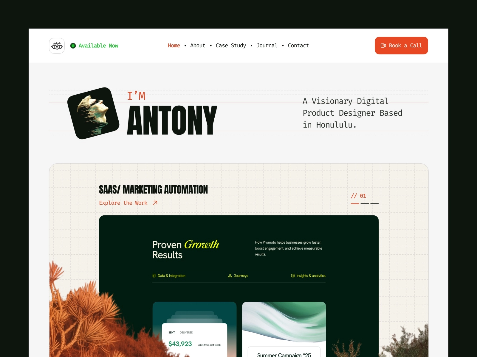
H3: Antony - Refined personal site with modern aesthetics
![][image1]
Your portfolio should explain how you think, not just what you made. Antony, built by WebTem, is an editorial template for product managers, UX researchers, and brand strategists who need to walk people through their process.
This intentional, process-driven design resembles a professional magazine. Its case study workflow structures projects into narratives, while the blog CMS and dedicated sections for testimonials and achievements create a comprehensive record of your career.
Key features:
- Case study workflow layout for deep project breakdowns
- Journal and blog CMS for regular writing
- Native sections for testimonials and achievements
This narrative editorial design uses high-contrast alternating dark and light zones to create visual rhythm. Elegant, minimal typography ensures readability remains the focus throughout long-form content.
Unlike the grid-heavy Jonas or motion-focused Zarafolio, Antony adopts an editorial magazine style. It highlights case studies, processes, and written insights, making it ideal for strategists who prioritize conceptual depth alongside deliverables.
H3: Jonas - Clean one pager for minimal storytelling
 ![][image2]
If you want a portfolio that feels like a polished product, Jonas delivers that precision. Built by Bryn Taylor, it is a sleek one pager made for product designers and UI/UX specialists who think in systems and grids.
The vibe is modern and highly structured. Everything sits in its place. The Bento Grid layout organizes your case studies into clean boxes that feel both contemporary and easy to scan. The active light and dark mode switches automatically based on system preferences. So your site always feels native to whatever device someone is using.
Key features:
- Single CMS for case studies
- Global style guide for rapid font and color swaps
- One page structure that loads fast and scrolls smoothly
The design trend is typography first minimalism. Plenty of whitespace gives your work room to breathe. Subtle micro interactions reward curious visitors without distracting them. Soft pastel and gradient accents add warmth to an otherwise clinical structure.
Jonas fits designers who want their portfolio to feel like the products they design. Structured, intentional, and quietly confident. If you live in Figma and think in components, this template speaks your language.
H3: JORGE - Free starter template with polished layouts
![][image3]
Some portfolios play it safe. JORGE does not. Built by Ludovic Losco, this free template is brutalist, bold, and editorial. It is made for visual artists, photographers, and 3D designers who want their site to feel like a premium design magazine.
The vibe is loud and unapologetic. Massive oversized text dominates the screen. Borderless layouts let images bleed to the edge. The permanent high contrast dark mode baseline creates drama from the first pixel. Everything feels intentional and slightly rebellious.
Key features:
- Full 7 page multi page site
- Dual CMS: one for case studies, one for your resume and timeline
- Smooth scroll linked fades
- Custom hover states that reward exploration
The design trend is editorial brutalism. Clean but confrontational. The typography does heavy lifting. Layouts reject conventional padding and boxes. Scroll linked animations create a cinematic flow as visitors move through your work.
JORGE suits creatives who want their portfolio to make a statement before anyone clicks a single project. If your work is bold and your personality is louder, this template matches that energy without asking you to tone it down.
H3: TD_Zarafolio - Built for creatives who need visual impact
![][image4]
If you want your portfolio to feel alive, TD_Zarafolio is built for motion. Designed by Tom D, this free template is highly animated, rhythmic, and modern. It is made for graphic designers, brand designers, and motion designers whose work relies on visual energy and a strong digital presence.
The vibe is kinetic and cinematic. Expressive scroll driven animations guide visitors through your pieces like a carefully edited film reel. The integrated grid structure keeps everything organized even when the movement gets ambitious. Swap able layout blocks let you restructure sections for your own branding without breaking the flow.
Key features:
- Highly responsive layout across all breakpoints
- Expressive scroll driven animations
- Integrated grid structure
- Easily swappable layout blocks for custom branding
The design trend is movement as narrative. Heavy focus on smooth micro movements. A clean monochromatic black and white color profile keeps attention on your work, not the frame. Tight typographic hierarchies ensure readability even when the page is in motion.
Where Jonas gives you structured boxes and JORGE gives you clean editorial text, Zarafolio uses active movement to keep hiring managers engaged while scrolling through your visual pieces. It suits creatives who treat their portfolio as a performance, not just a presentation.
H3: Portfolite - Sleek option for solo creators or agencies
![][image5]
Portfolite, a Framebase creation, is a refined hybrid designed for high-level freelancers and boutique agencies alike. It functions as a powerful tool that connects a personal creative showcase with a professional service-oriented presentation.
The template is built for those who require a portfolio that matches their professional intensity, providing a sophisticated bridge for presenting work to elite clients.
The vibe is corporate minimal with gallery polish. The monochromatic museum aesthetic keeps attention locked on your work. High contrast black and white frames your projects like pieces in a curated exhibition. Invisible grid architectures stay completely out of the way. Your images speak first. Oversized clean typography adds authority without shouting.
Key features:
- Dual purpose portfolio plus agency structure
- Optimized single landing page setup
- Global design tokens for effortless scaling
- Native high performance responsive breakpoints
The design trend is invisible architecture. Everything is structured yet nothing feels rigid. It is minimalism with commercial intent. While Antony focuses on personal narrative and JORGE is purely artistic brutalism, Portfolite frames you as a client ready service provider. Your projects sit front and center. Your professionalism sits right behind them.
Portfolite suits creatives who want to look like a business, not just a person with a laptop. If you pitch to corporate clients and need your site to close deals before you open your mouth, this template sets that tone.
H3: Hanssen - Whitespace forward design with clear hierarchy
![][image6]
Hanssen, created by Pawel Gola, provides an extensive digital experience rather than the typical single-page portfolio. It strikes a balance between a high-end gallery and a functional professional dashboard, projecting a feel that is both meticulously structured and artistically refined.
The vibe is expansive and interactive. Nine pages give you room to breathe. Dedicated Work, About, Contact, and Blog sections let you build a complete digital presence rather than a quick introduction. The asymmetric split layout creates visual tension without chaos. Native light and dark mode switches based on preference. Full Framer CMS integration means your blog and projects update smoothly without touching code.
Key features:
- 9 page multi page architecture
- Asymmetric split layout for visual interest
- Native light and dark mode
- Full Framer CMS for blogging and project updates
Hanssen features dashboard-inspired minimalism with a sharp monochromatic profile. Its grid-based, modular architecture includes advanced interactive elements and polished component blocks for scalability.
In contrast to Portfolite's corporate look or JORGE's brutalism, Hanssen provides an expansive interactive experience. It is ideal for creatives needing a structured platform to combine case studies, design projects, and blogging.
H3: Zayla - Bold visuals for standout personal branding
![][image7]
While most portfolios merely suggest a browse, Zayla demands a stay. Crafted by Zaid Khan, this high-impact template is both sleek and fearless. It was designed specifically for developers, digital artists, and independent creatives who want their online presence to command attention like a major event.
Zayla delivers a cinematic, conversion-focused vibe using an immersive dark mode aesthetic with vibrant gradient accents. Asymmetrical grids and bold typography break conventions while maintaining usability. Fluid animations and interactive features effectively guide visitors toward taking action.
Key features:
- 8 page multi page layout ready to use
- Full screen overlay navigation menu
- Powerful CMS with custom grid sorting
- Built in fit image aspect ratio tools
Zayla utilizes a high-impact dark mode aesthetic designed for conversion. Key visual elements, such as specialized overlay navigation, custom grid sorting, and precise aspect ratio tools, prioritize media integrity while guiding visitors toward inquiry buttons.
Contrasting with Hanssen's dashboard style, Zayla offers a high-contrast spectacle. It is the ideal choice for bold creatives who want vibrant animations to actively drive client hiring from a dramatic digital backdrop.
H3: Retro'98 - Nostalgic 90s inspired design aesthetic
![][image8]
Your portfolio should not blend in. Retro'98, built by Nick404, makes sure it does not. This template transforms your site into a fully functional 1990s desktop screen. It is playful, nostalgic, and impossible to forget.
This Windows 98-inspired interface uses classic gray boxes, pixel graphics, and desktop icons to create a nostalgic experience. A built-in CMS manages projects within retro windows, while custom buttons and a responsive layout ensure the vintage aesthetic remains intact and functional across all devices.
Key features:
- Fully interactive Windows 98 style desktop interface
- Built in CMS engine for project management
- Custom buttons and retro window frames
- Highly responsive across all devices
The design trend is skeuomorphic retro tech. Heavy reliance on pixel graphics. Classic computing aesthetics recreated with modern functionality. It is not just a look. It is an experience.
Retro'98 is designed to stand out, intentionally diverging from the polished, corporate aesthetics of templates like Jonas or James Parker. It serves as a striking icebreaker for web designers, developers, and fans of vintage tech who want to make a lasting impression. By choosing this template, your individual personality takes center stage, overshadowing your specific projects or workflows to become the primary focus for potential clients.
H3: Perform - Tailored for coaches and athletic professionals
![][image9]
You coach people. You do not build websites. Perform, built by Sebadam.supply, closes that gap in a single afternoon. It is high energy, athletic, and strictly business. Made for personal trainers, fitness coaches, gym owners, and performance driven wellness brands.
This conversion-focused layout uses bold typography and athletic alignment to command authority. Structural blocks funnel visitors toward signups or booking calls without distraction. Every element is disciplined and goal-oriented, pushing users directly into action.
Key features:
- Lightning fast 3 page structure: Home, Contact, and 404
- Conversion first marketing funnel design
- Built in CMS collections for coaching tiers, pricing plans, and FAQs
Designed for direct response athleticism, this style uses bold typography and structured layouts to eliminate decision fatigue. It prioritizes clear pricing grids and onboarding flows over complex case studies.
Perform serves as a focused sales tool, distinct from creative portfolios like Perso or Zarafolio. It is ideal for trainers seeking to quickly sign clients and sell packages with minimal administrative effort.
H3: Portavia - Minimal Portfolio Template
![][image10]
Your portfolio should sell your process, not just your pixels. Portavia, built by oldshen and Duncan Shen, is a high impact strategic template for UX/UI designers, digital product developers, and modern creative studios. It balances business strategy with high end design in a way that feels polished and intentional.
The aesthetic blends agency-style pitches with personal showcases using clean, airy, monochromatic layouts. Smooth light-to-dark transitions and micro-animations enhance navigation without distraction. Visitors are guided through a methodology of research, concept, and delivery.
Key features:
- Complete multi page system with featured project showcase
- CMS ready blog and insights backend
- Built in timeline and experience trackers
- Integrated client testimonial blocks
- Conversion focused contact forms
Strategic clarity defines this design. Each section details your process, featuring full-width imagery alongside narratives. Integrated testimonials and conversion-focused contact forms are positioned to build trust and drive decisions.
Portavia bridges the gap between high-contrast drama and rigid corporate structures, presenting portfolios as high-end agency pitches. It balances final visuals with collaboration styles, making it ideal for designers who value both thinking and deliverables.
Pick the template that matches your current project volume and future growth. A one pager works for six to eight strong pieces. A multi page site suits ongoing blogs, case studies, and service offerings. The right choice is the one you will actually keep updated.
H2: How to Choose the Right Portfolio Template
Picking the right template means matching the layout to how you work, not just what looks cool. Your role and content type should drive the decision, not trends.
Product and UI/UX designers need structural layouts. Bento grids, like those in Jonas, organize complex information into clean visual cards. Recruiters digest your workflow, project details, and statistics without drowning in text walls.
Visual artists and photographers should choose brutalist or editorial minimal templates like JORGE or Portfolite. Look for permanent high contrast dark modes, massive font sizes, and minimal grid borders. The design stays invisible so your photography, 3D renders, or artwork command full attention.
Motion designers and front end developers need animation heavy templates like Zarafolio or Retro'98. Scroll driven interactions and custom states turn your layout into a living demo of your technical skill the second someone lands on your page.
Strategists, writers, and managers benefit from storytelling layouts like Antony or Hanssen. Deep dive journal sections and case study pages with excellent paragraph typography let you explain how you solve business problems in long form.
Freelancers and service providers should prioritize conversion and credibility. Templates like James Parker feature testimonial sliders, pricing grids, performance metrics, and obvious call to action buttons. Your site sells before you speak.
The golden rule is simple. Audit your existing case studies first. Heavy text and data demand structured multi column layouts. Stunning visuals need image first minimal canvases. Match your content to your container.
H2: Tips for Customizing Your Framer Portfolio
Customize efficiently by changing global tokens first, then auditing breakpoints, and keeping animations intentional. The goal is making the template yours without breaking the structure that made it great.
Start with global styles: Head to the Assets panel and update color variables and typography. One change to your primary brand color re themes the entire site instantly. Do not waste time tweaking pages individually.
Check your breakpoints immediately after swapping text or images. Tablet and mobile layouts can shift unexpectedly. Headers wrap awkwardly. Boxes clip. A quick audit prevents embarrassing layout breaks on smaller screens.
Keep animations subtle: Stick to native motion or use gentle entrance fades with scale variations between 10 and 20 percent. Set damping between 30 and 40 for smooth premium movement. Overloading spins and scales slows loads and distracts recruiters.
Compress assets before uploading: Run case study images through TinyPNG and convert to webp format. Keep hero images under 300 KB. Hiring managers bounce when pages crawl.
Use the CMS engine properly: If your template includes CMS collections for projects, use them. Do not manually paste text layers for new pages. CMS updates apply across all projects simultaneously when you redesign later.
Before publishing, update your favicon, site title, and SEO description in Framer Project Settings. Leaving default metadata tells recruiters you used a pre-made theme. Small details signal professionalism.
H2: Conclusion
The best portfolio is the one you publish. A template removes the friction of starting blank and gives you a structure you can grow into. Whether you choose minimal, bold, retro, or corporate, the key is launching and iterating.
If none of these templates match your exact vision, we build custom Framer templates too. At WebTem, we design and develop portfolio and agency templates tailored to your brand, your content, and your goals. No generic layouts. No forced fits. Just a site that feels like you from the first click.
Ready for a portfolio that stands out? Explore our custom Framer templates at WebTem.